|
|
Post by Richter Abend on Jul 28, 2014 21:36:40 GMT -6
A companion thread to my own sprite gallery, here you can post sprites that you would like to improve and I will teach you things you could potentially do to make them better. I'm not a perfect spriter by any means, I'm also a master thief and a liberal, and will always have room for improvement, but I still think I can impart some of the wisdom I've learned to you.
Staff:
Richter
Students:
Butorega
Ryuzaki
Rogus
Mana
Graduates:
None
|
|
Borgus
Acolyte  DEAD
Getting money is easy. The ahrd part is keeping it.
DEAD
Getting money is easy. The ahrd part is keeping it.
Posts: 90  Profession: Bandit
OoC Alias: Butorega
Profession: Bandit
OoC Alias: Butorega
|
Post by Borgus on Jul 28, 2014 23:11:33 GMT -6
I am a decent spriter myself, but like the old masters use to teach you always have room for improvement. Attachments:

|
|
|
|
Post by Richter Abend on Jul 28, 2014 23:57:21 GMT -6
Solid mugs, though I can see you did some clean-up on the no mustache Burt that isn't present in the mustache Burt.
There's nothing glaringly wrong just more clean-up. The chunk of hair up in the corner of his forehead seems a bit out of place, as does the little brown line coming out from under his bang. Also, right under his nose it looks like you might have left some skin shading from around the mustache when the mustache was still there, so if that's not intentional there's always that.
Finally, the hair coming down the back of his head gets a little messy shading-wise right when you reach the collar, and could afford to be smoothed out, but it's nothing critical to the overall look of the mug.
|
|
Borgus
Acolyte
DEAD
Getting money is easy. The ahrd part is keeping it.
Posts: 90
Profession: Bandit
OoC Alias: Butorega
|
Post by Borgus on Jul 29, 2014 7:17:35 GMT -6
Alright I think I got everything Attachments:
|
|
|
|
Post by Richter Abend on Jul 29, 2014 9:03:59 GMT -6
There's still a couple things:
-Between his hair and his chin there are some junk sprites
-There's a couple of pixels coming off of his chin that don't look like they should be there
-You need to get rid of the ear ring that's coming out of his neck
-His hairline could be better shaded
|
|
Borgus
Acolyte
DEAD
Getting money is easy. The ahrd part is keeping it.
Posts: 90
Profession: Bandit
OoC Alias: Butorega
|
Post by Borgus on Jul 29, 2014 11:38:09 GMT -6
Alright lets try again Attachments:
|
|
|
|
Post by Ryuzaki on Jul 29, 2014 13:20:09 GMT -6
So here's the mug I've been working on for when Ryu promotes. I already edited the shoulder proportions and the hood height, and I think I resolved the face issue. Any suggestions?  |
|
Rogus
Thief
Arrogance is a virtue.
Posts: 178
Profession: Stealing yo' gold
Guild: SS
Affinity: Fire
OoC Alias: Gus
|
Post by Rogus on Jul 29, 2014 13:54:48 GMT -6
If I may comment, Ryuzaki appears to have lost his neck. Unless his chin and jaw really are that long. It looks really awkward, but there's some definite improvement, keep working on it! Richter, just for kicks I'd like some critique on a few of the mugs i've made. (some might be older, or being used by someone else)  Mystigan  Garen (from LoL)  Rogus  Vaan  This crazy dude. |
|
|
|
Post by Richter Abend on Jul 29, 2014 15:30:23 GMT -6
That's pretty solid, Buto. One last thing, though. There's a point in his hair, on the left (our right) side of the mug's head where you can see the splice line. Try and blend that a little better. So here's the mug I've been working on for when Ryu promotes. I already edited the shoulder proportions and the hood height, and I think I resolved the face issue. Any suggestions? It's getting better, but like Rogus said, room for improvement.  -Orange: Try pulling back the right (our right) side of his hood more. From this perspective we should only be able to see maybe 3 pixels worth of hood next to his face, and probably not as much up top. You may want to take a pixel or two more off. Additionally, add some curvature around his neck. His shoulders are getting lost. -Red: These show where his shoulders are using his eye as a basepoint. When sculpting the shoulders, make sure you remember these locations so you don't add too much or too little overcoat. -Yellow: Like the red lines, only this shows how high his shoulders are. Important to know when sculpting the shoulders. Richter, just for kicks I'd like some critique on a few of the mugs i've made. (some might be older, or being used by someone else) Mystigan: Pretty solid. Biggest thing would be that the chunk of his hair on our left could use a bit more definition. The whole hair could use a bit more stroking out, but that part is where it is the most noticeable Garen: Parts of his outline are missing, such as next to his eye, on his neck, and on the tips of his pauldrons. Not much to be said. Rogus: No real issues, per say, though his head looks a bit small for his body. His shoulders a very broad. Vaan: Good, basic mug, though the scar that ropes past his eye is a little squiggly. That crazy dude: The white in his left eye looks a bit off. Not quite sure what's going on there. The shading on his skin along the edges of his mask could be enhanced a bit, and the part of his mask where his ear would be would probably look better if it extended right up into his bandanna. Also there's no outline on the right (our left) side of his mask. |
|
|
|
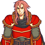
Post by Ryuzaki on Jul 29, 2014 17:23:27 GMT -6
And here is the next rendition, with the changes implemented.  |
|
|
|
Post by Richter Abend on Jul 29, 2014 18:14:35 GMT -6
That's kind of a step backwards.
The original shoulder width you had was fine, I was just using the red lines to give you and idea of where his shoulders were under the coat. You also made him shorter, where there was no reason too, and added to the top of his forehead to compensate, making him look top heavy.
Try again, following my orange outline a little more closely this time, and don't lower the mug.
I will say good job on better defining his left (our right) shoulder. That's the right idea.
|
|
Borgus
Acolyte
DEAD
Getting money is easy. The ahrd part is keeping it.
Posts: 90
Profession: Bandit
OoC Alias: Butorega
|
Post by Borgus on Jul 29, 2014 19:13:30 GMT -6
Ok once more Attachments:
|
|
|
|
Post by Ryuzaki on Jul 29, 2014 20:48:38 GMT -6
This is my new splice of Willow.  |
|
|
|
Post by Richter Abend on Jul 29, 2014 20:54:01 GMT -6
@buto: Looks good
@ryu: Not Pedo enough
|
|
|
|
Post by Ryuzaki on Jul 29, 2014 21:02:53 GMT -6
...No, really. Any input?
|
|